I’m really not that great at the whole change thing. Depending on what is it, I might daydream about the awesomeness of something new, but actual implementation can be pretty dicey. I reach a certain point and just want to go back to the way things werrrrrrrre. Whine.
This change, though, is one I’m actually pretty excited about. As you can see, Kitchen Treaty doesn’t look like this anymore.
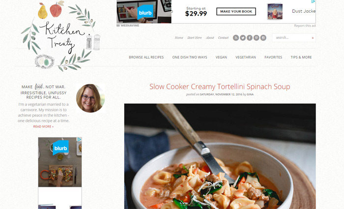
In fact, it looks a lot – a loooottttt – different.
See, this year, I’ve been thinking a lot about this blog here and how best to improve it. I want to provide you with more of what you want (easy weeknight dinner ideas, anyone?!) and also help you find what you’re looking for as easily as possible.
It wasn’t long before I realized that, at least to achieve the latter, a full-on redesign was in order.
Redesign Goals, Man, Goals
My goal with the redesign was actually twofold. First, it was also time to freshen up my “brand” so to speak – a new logo and a fresh color palette were a great place to start.
Here’s a look through the logos of the ages.
I did this first one myself, and though it took me about 100 hours to make, I was pretty proud.
![]()
This hand-drawn logo by artist Katt Frank had a softer, more accessible feel. My favorite part? The pear and the apple. Apples represent peace in some parts of the world and, well, I just sort of like pears. Plus, together they sort of represent my guy and I – we’re the same, but different, diet-wise. But we still work well together.
![]()
So for the new logo, I carried over the pear and the apple. (Lindsay is incredible, and I don’t know why I ever tried to design logos myself!)
![]()
Oh, and just for fun, did you know Kitchen Treaty was almost called Gruntilicious? Yeah. I don’t know what else to say about that.
![]()
Actually, it was almost called “Franks and Beans,” too.
![]()
I understood the double entendre, so to speak, and thought it was funny. Until I was knee-deep in designing the first iteration, proudly suggested my guy check it out, and he accidentally mistyped the URL. I’m sure you can imagine what kind of website he ended up on.
Kitchen Treaty it was!
Anyway, my other goal? Usability, man! I want to help you get around the blog easier – and find more “buried” recipes and goodies while you’re at it. It’s so important to me that Kitchen Treaty be as user-friendly as possible, and I’m working on a more in-depth post about that and my survey results. Coming soon.
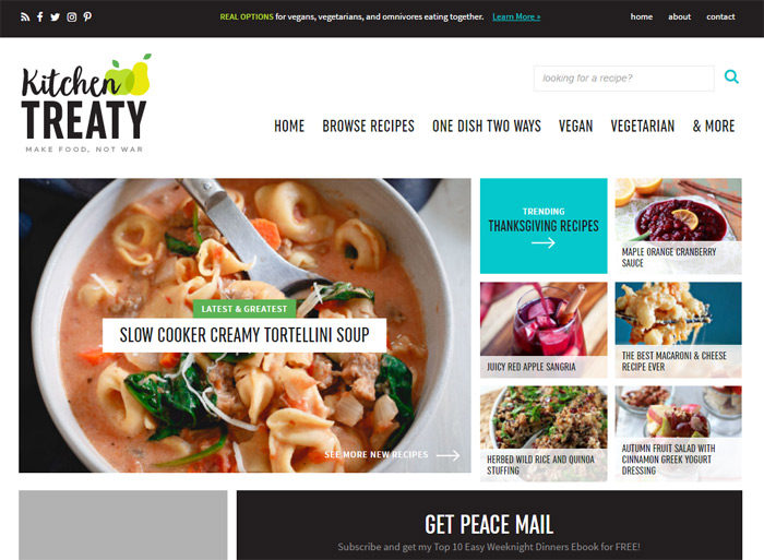
The New Kitchen Treaty at a Glance
So! How to get around the new Kitchen Treaty?!
Homepage
The homepage is pretty self-explanatory. The newest post is front and center, in the upper left. The area to the right is reserved for seasonal/trending recipes – usually popular recipes that have been on the blog for awhile.
Below that you’ll find more new recipes (and old favorites too, like seasonal slow cooker dinners or favorite breakfasts).
Recipe Index
The Recipe Index is similar to before – reorganized a bit, but still easy peasy.
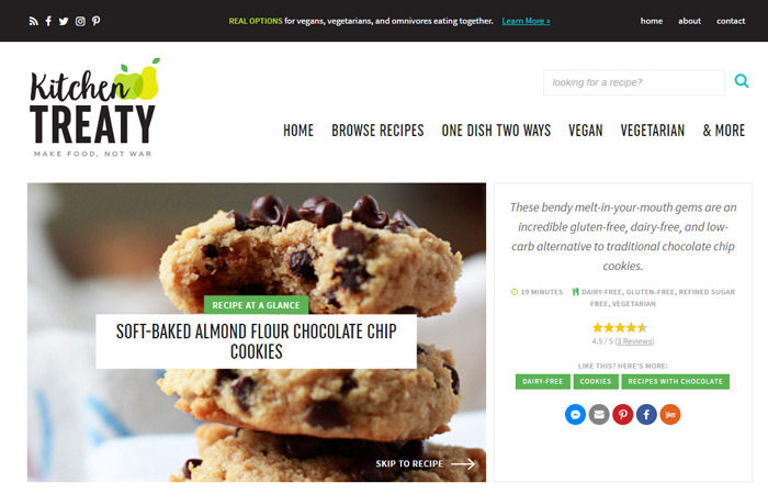
Recipe At-a-Glance
But the part I’m most excited about (okay, other than the homepage)?! The recipe posts! At the top of each recipe post is “Recipe at a Glance,” a nice little summary – expanded and polished from what I had before – featuring a photo of the finished dish, a quick description, and with a link to take you right to the recipe if you desire.
Oh, and I’m also darn excited about the …
Recipe Ratings & Expanded Comment Functionality
I’ve been wanting a reliable recipe ratings system for awhile now, and after a couple of tries (and many lost recipe ratings – my heart breaks), my awesome developer found a solution. Now, I think (fingers crossed!) I have a robust recipe ratings system that should never break.
So please, will you pretty please go in and rate those favorite recipes? I will love you forever.
Along with my new recipe ratings, the comment functionality has been expanded. You can label your comment as a question, review, or just a comment. This helps me get to your questions faster, and helps readers sift through comments more efficiently. Basically a win-win.
So there, my friends, is the scoop! I hope you’re okay with the change – if not, you know I understand! But I hope you’ll stick around and hope that, soon enough, you’ll find you love it as much as I do.
And please know there are still a few kinks to be worked out, and I apologize for any wonkiness you experience over the next few days! (Feel free to comment or email about any said wonkiness, by the way – I do appreciate the heads-up in case we haven’t noticed it).
I’d love to hear your thoughts, so feel free to comment here or contact me.
Onward!
—
The shiny new Kitchen Treaty website – logo/brand identity, design, and development – was created by the fabulous Lindsay Landis of Purr Design (she’s also the fellow food blogger behind Love and Olive Oil). I thank my lucky stars often that I get to work with her! Thank you, Lindsay!
 I’m so glad you’re here! I’m a vegetarian home cook, certified plant-based pro, and mom. I’m married to an enthusiastic carnivore, and my mission is to achieve peace in the kitchen – one tasty recipe at a time. These days, with a name like mine, I also try not to ask to speak to the manager.